Creating Dynamic Bar Charts with Python’s Matplotlib#
Introduction:#
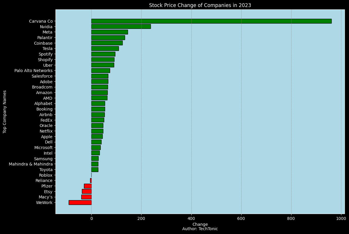
Visualizing data is an essential aspect of data analysis and presentation. One effective way to represent data is through bar charts, which display data values as rectangular bars. In this tutorial, we’ll explore how to create dynamic bar charts using Python’s Matplotlib library. We’ll create a bar chart to visualize the stock price changes of various companies in the year 2023.
Prerequisites:#
Before we begin, make sure you have Python and Matplotlib installed. You can install Matplotlib using the following command:
pip install matplotlib
Step 1: Importing the Required Libraries#
To get started, we need to import the Matplotlib library that provides tools to create various types of plots, including bar charts. Open your favorite code editor or Jupyter Notebook and follow along.
import pandas as pd
import matplotlib.pyplot as plt
Step 2: Data Preparation#
For this example, we’ll use a sample dataset containing information about the stock price changes of different companies. You can replace this dataset with your own data.
# Read the CSV file using pandas
data = pd.read_csv('stock_data.csv')
data.head()
| Company | Country | Change | |
|---|---|---|---|
| 0 | Carvana Co | USA | 962 |
| 1 | Nvidia | USA | 237 |
| 2 | Meta | USA | 145 |
| 3 | Palantir | USA | 133 |
| 4 | Coinbase | USA | 124 |
Step 3: Creating the Bar Chart Function#
Let’s create a function named create_bar_chart that takes the necessary parameters to customize the appearance of the bar chart.
def create_bar_chart(data, x_column, y_column, title, bg_color, x_label, y_label):
    plt.style.use('dark_background')  # Use dark background style
    plt.figure(figsize=(12, 8))

    # Set background color
    plt.rcParams['axes.facecolor'] = bg_color

    colors = ['green' if value > 0 else 'red' for value in data[y_column]]
    bars = plt.barh(data[x_column], data[y_column], color=colors)
    plt.xlabel(x_label, color='white')
    plt.ylabel(y_label, color='white')
    plt.title(title, color='white')
    plt.gca().invert_yaxis()  # Invert y-axis to have the highest value at the top

    # Set tick labels color to white
    plt.xticks(color='white')
    plt.yticks(color='white')

    # Add grid lines with custom color
    plt.grid(axis='x', linestyle='--', linewidth=0.5, color='gray')

    # Change the color of the bars
    for bar in bars:
        bar.set_edgecolor('black')

    # Add author name to the chart
    plt.text(0.5, -0.08, 'Author: TechTonic', transform=plt.gca().transAxes, color='white', fontsize=10, ha='center')

    plt.tight_layout()
    plt.show()
Step 4: Customizing and Creating the Bar Chart#
Now, let’s specify the column names and other parameters to create the bar chart.
# Specify column names and other parameters
x_column = 'Company'
y_column = 'Change'
title = 'Stock Price Change of Companies in 2023'
bg_color = 'lightblue'
x_label = 'Change'
y_label = 'Top Company Names'

# Call the function to create the bar chart
create_bar_chart(data, x_column, y_column, title, bg_color, x_label, y_label)
Conclusion:#
In this tutorial, we’ve learned how to create dynamic bar charts using Python’s Matplotlib library. By customizing various parameters, such as background color, labels, and grid lines, we can create visually appealing and informative bar charts to visualize data effectively. Experiment with different datasets and customization options to create engaging visualizations for your data analysis projects.